
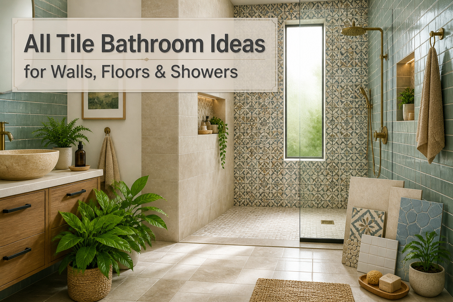
An all-tile bathroom can run from a few hundred dollars in basic subway ceramic to triple that in natural stone, and the deciding factor is not the tile you love but the substrate you are willing to prep. Large format porcelain needs a level floor within 1/8 inch over ten feet or the edges telegraph every bump; skip that step and even 48-inch tiles read as amateur work. Start with the wet zone, floor to ceiling above the shower, and expand only if the budget holds.
1. Fully Tiled Bathrooms
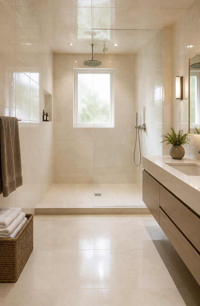
Porcelain tile with a water absorption rate below 0.5% makes the strongest case for taking tile all the way up the walls and across the ceiling. In a room that sees steam, splatter, and standing water, that low absorption matters more than the pattern you choose. The tile forms a waterproof envelope, and the visual payoff is the continuity: no painted drywall to stain, no caulk line where two materials meet, just the same surface wrapping every plane.
I spent an afternoon once staring at a half-tiled bathroom, trying to figure out why it felt smaller than it was. The eye kept stopping at the paint line. Full coverage erases that break. The floor tile runs up the wall, the wall tile runs across the ceiling, and the room reads as one volume instead of a box with a shower cornered inside. Grip-enhanced or matte finishes keep the floor safe under wet feet, while the same body of tile in a smoother finish climbs higher where traction matters less.
The cost is real. Tiling a ceiling means more tile, more labor, more adhesive. For a weekend project on a few hundred dollars, start with the wet zone: floor, shower walls, and the ceiling directly above the shower. Expand outward only if the budget stretches. The mistake I see most often is stopping at the shower curb and leaving a strip of painted wall that will need repainting inside two years.
2. Large Format Tiles
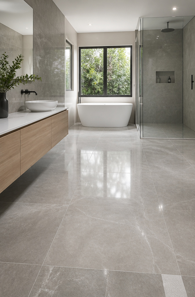
Tiles up to 48" x 48" are where the visual shift happens. Fewer grout lines break up the surface, so the eye reads the floor or wall as one continuous plane. In a small bathroom, that continuity matters more than almost any color choice; the space simply feels larger because there is less visual grid to chop it up.
The tradeoff is in the prep. Large format tile needs a very flat substrate, or you get lippage, those uneven edges where one tile sits higher than the next. Standard mortar beds often will not level out enough on their own. A self-leveling underlayment or a poured substrate adds half a day and some cost, but skipping it leaves you with a floor that looks cheap no matter how expensive the tile was.
I have seen the same beige stone-look porcelain read as "spa" in one install and "botched DIY" in another, and the difference was almost always whether the installer checked the subfloor with a long level before the first trowel hit.
3. Subway Tiles

The 3-by-6 inch rectangle is still the cheapest full-coverage wall tile at any big-box store, which is why it survives as the default for rental refreshes and first-home gut jobs. Running it in the classic horizontal offset keeps the labor simple; your installer, or you on a Sunday, does not have to make a single diagonal cut until the ceiling line. Flip the same tile to a vertical stack and the room reads taller without adding a dollar to the material bill. A straight stacked grid, horizontal or vertical, turns the pattern modern and cuts the install time further since every edge lines up.
Grout is where the look lives or dies. Matching grout dissolves the grid into a quiet field, which is what most sources show in their "timeless" examples. A contrasting grout, even just one shade darker, makes each rectangle pop and the wall reads busier, more graphic, more intentional. I have seen bathrooms where the owner spent $80 extra on epoxy grout and got a shower that stayed clean-looking for years; the water resistance matters more than the color choice in a steamy room. The glossy glaze on standard subway tile bounces light around a small bathroom, but that same shine shows soap scum by Wednesday. Matte finishes hide the daily mess, though they cost more per square foot and not every store stocks them.
4. Mosaic Tiles
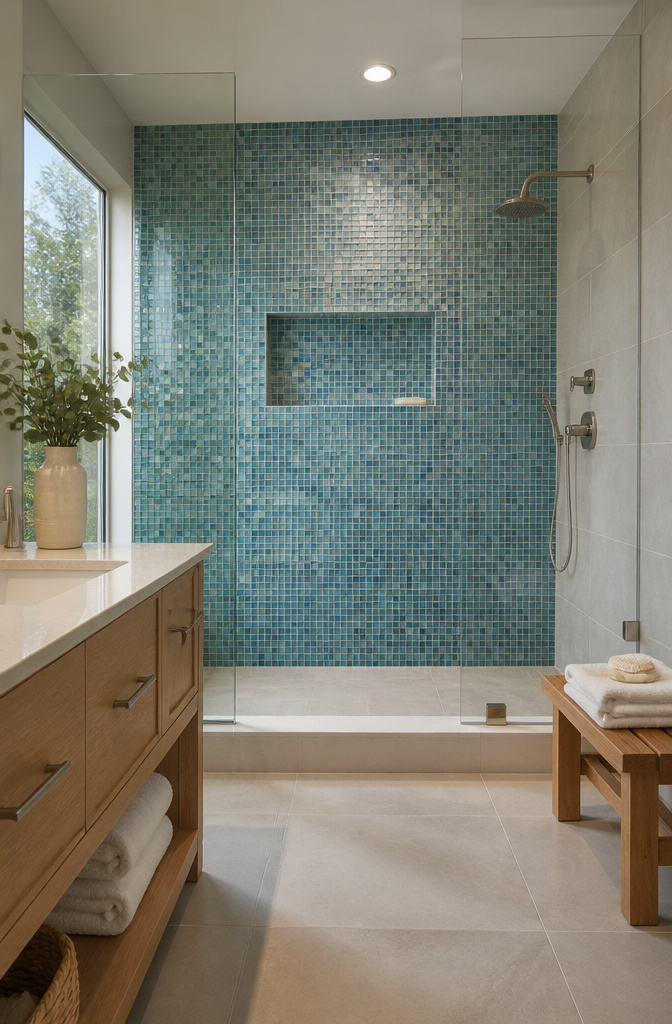
Small-format tiles on mesh backing solve the one problem large tiles cannot: curved walls, shower niches, and any surface that refuses to stay flat. The mesh lets the sheet bend around a corner or arch without the lippage you’d fight with a 12-by-24 plank. That flexibility comes at a cost. More grout lines mean more scrubbing, and the intricate patterns that draw the eye also trap soap scum in crevices a squeegee won’t reach.
I like mosaics for a single accent wall or the back of a niche where they stay visible but out of the daily splash zone. The 1×1 sizes from Fireclay’s lineup, whether in sea-glass blues or that melon-pink Desert Bloom, show how a little tile shifts the whole mood of a room. Penny rounds soften edges in a way square mosaics don’t, though the curved profile adds even more grout to maintain.
The cleaning reality is what stops me from tiling an entire shower with them. High-quality grout and sealer help, but the maintenance load scales with the line count. Use mosaics where they matter visually, and keep the field tile large where water hits hardest.
5. Terrazzo Tiles
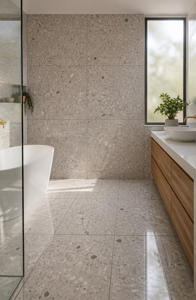
Terrazzo tiles bring that poured-composite look without the poured-composite headache. Chips of marble, quartz, glass, or metal sit suspended in cement or resin, giving the same speckled surface that used to require a crew and a week of curing. Modern versions come as prefabricated porcelain or ceramic tiles, which means you get the visual texture without the maintenance vintage installations demanded.
The difference between old and new is practical, not just aesthetic. Original terrazzo was porous, prone to staining, and needed regular sealing. Current production allows terrazzo-look tiles to arrive pre-sealed, with resin or porcelain bodies that resist water and wear on their own. The speckling reads as retro, but the performance is contemporary.
For an all-tile bathroom, terrazzo works as a statement wall or a floor that hides water spots and dust between cleanings. The Sloane 2×2 Matte Porcelain Mosaic in Pearl captures the effect with soft tonal variation and subtle speckling, pairing cleanly with light wood and muted greens. Genuine terrazzo still exists if you want it, but the porcelain interpretation wins for a weekend project with a real budget.
6. Encaustic Tiles
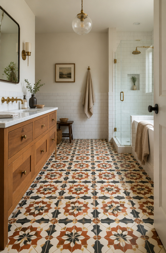
Encaustic tiles carry their pattern all the way through the body, not just on the surface. Traditional versions are built from inlaid clays of different colors pressed together and fired into one solid piece, so the design survives years of wear instead of wearing off like a glaze would. That same construction means they have been making bold geometric and floral statements since medieval times, when the technique spread across Europe and into Moorish-influenced regions.
The visual payoff is immediate: interlocking circles, starbursts, or layered florals turn a bathroom floor or shower wall into the room’s focal point. A brown and off-white palette, for instance, pairs cleanly with brass fixtures and a white vanity without feeling like a period set.
Wet areas do demand respect. Cement-based encaustics are porous and need sealing before grouting, then resealing at intervals to prevent water staining. Porcelain and ceramic versions that replicate the look sidestep some of that maintenance while keeping the same graphic impact, which is the route I’d weigh for a weekend project with a real budget.
7. Penny Round Tiles
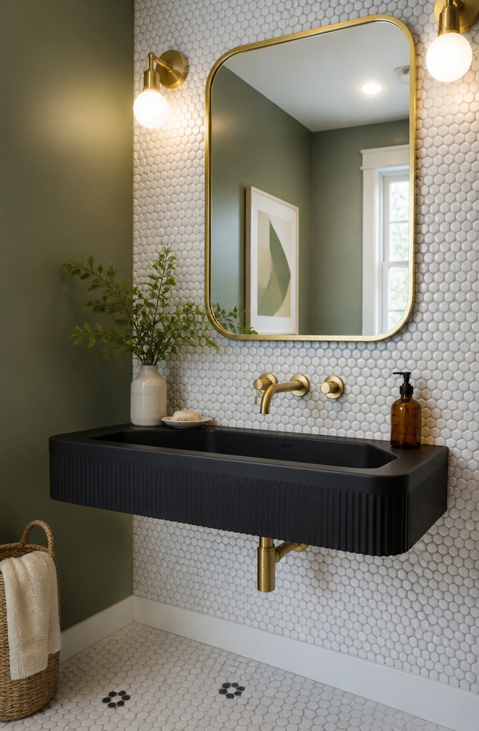
Penny round tiles are small circles, usually about the size of an actual penny, that pack a surprising amount of personality into a bathroom. Their curved edges soften the geometry of a room in a way square tiles never quite manage, and the retro association is immediate: a black floor of penny rounds with white grout reads 1950s diner, while a wall of white ones in a shower niche feels more midcentury spa. The texture is the selling point and the catch in one. Every tile is a bump, every gap is grout, and the surface you get is roughly one-third mortar lines. That handmade, mosaic quality the sources praise is real, but so is the maintenance. A floor of penny rounds collects grime in all those crevices; a wall behind the sink is less punishing. The budget is friendly, especially in basic white porcelain, and the graphic pop of contrasting grout lets you steer the look vintage or modern. My call: keep penny rounds off the main bathroom floor unless you enjoy scrubbing, but use them freely in a powder room, a shower bench face, or a single accent wall where the texture gets noticed and the cleaning stays manageable.
8. Natural Stone Tiles
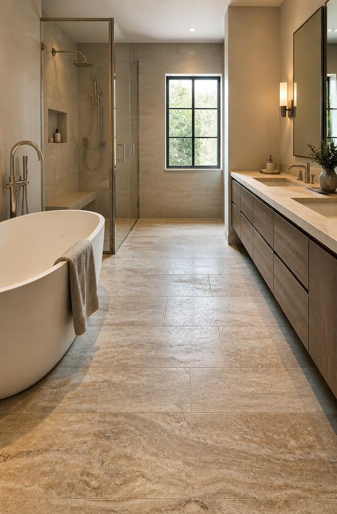
Marble, slate, travertine, and limestone each bring something porcelain cannot replicate: a surface that keeps changing. Water and soap and bare feet slowly soften the gloss on honed marble, darken the high spots on slate, and open the pores of travertine until the stone looks like it has always lived there. That patina is the reward, but it costs maintenance. Penetrating sealers need reapplication at least once a year in a working bathroom, more often on shower floors and vanity tops where water sits.
The slip question matters most underfoot. Polished marble registers as genuinely hazardous when wet; honed finishes add enough texture to help, though they still fall short of the grip you get from textured porcelain. Limestone and travertine run similarly slick unless you choose a brushed or tumbled finish, which trades some refinement for traction.
Price reality is sobering. Natural stone runs roughly double the material cost of quality porcelain, and the gap widens with installation because cuts take longer and waste runs higher. The marble-look porcelains now on the market, like the Calacatta Antico lines, nail the veining well enough that I have paused in showrooms to check whether a slab is real. For a rental or a first bathroom project with a weekend timeline, porcelain wins on every practical count. Stone justifies itself only if the living surface, the cool weight underfoot, and the gradual aging are the specific qualities you are building around.
9. Brick Look Tiles
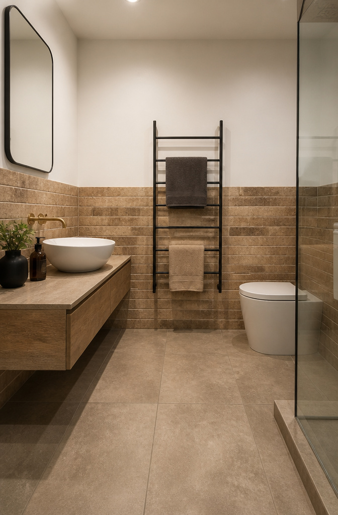
Brick look tiles borrow the rectangular format of actual brick but add intentional surface variation that reads as reclaimed rather than factory-perfect. The slight irregularities in the glaze, the soft edges, the matte finish that catches light unevenly, these are what separate convincing brick tile from the flat, printed kind that undercuts itself the moment you step close.
The pattern you lay them in decides whether the illusion holds. A running bond, the classic staggered offset, lets the eye read the wall as continuous masonry. Herringbone works too, though it reads more as a floor or fireplace detail moved to the bathroom, and it costs you more cuts and more waste. What breaks the spell is a stacked grid: the lines align too neatly, and suddenly the tile announces itself as tile. The Marsden 3×10 in Almond, laid herringbone, gets away with it because the light terracotta tone and soft variation in the surface keep the eye moving. Industrial gray or classic red demand the same care; whitewashed versions forgive a little more because the color itself suggests age and handwork.
Porcelain or ceramic body keeps the water out, which real brick cannot promise in a shower. The warmth and texture arrive without the maintenance of actual masonry, and for a weekend project with a few hundred dollars in materials, that trade is the whole point.
10. Zellige Tiles
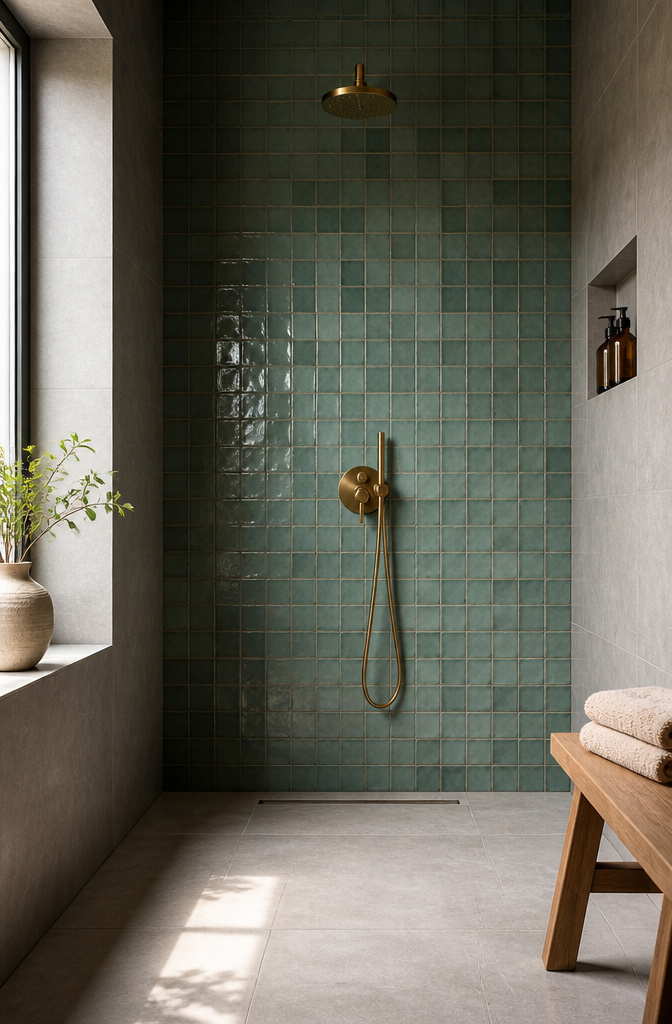
Zellige tiles carry the slight wobble of a hand pressing clay into a wooden mold, and that unevenness is exactly what makes them worth the trouble in a bathroom. Light skims across the glazed surface at different angles, so the same wall shifts from pale celadon to something closer to jade as you move through the room. The color variation is deliberate, batch to batch and tile to tile, which means ordering 15% over your square footage is non-negotiable; you will need the extras to blend the tones evenly rather than clustering the darkest pieces in one corner.
The edges are not square. They taper and thicken where the glaze pooled, so standard spacers fight you. A installer I trust sets these in a thick-bed mortar with a 3/16-inch grout line, then pushes individual tiles in or out until the highs and lows read as texture rather than mistake. Grout color matters more here than with machine tiles: go too light and every irregularity screams, too dark and you lose the watery depth the glaze is meant to give. I would pick a mid-tone gray that sits between the palest and deepest tile in the box, then step back before the grout cures to make sure the wall reads as a field, not a grid.
11. Textured Tiles
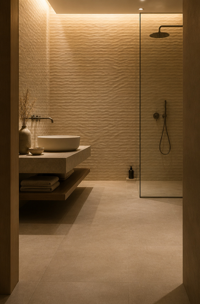
Three-dimensional tile surfaces, from gentle ripples to sharp geometric relief, do something flat glaze cannot: they catch light at different angles through the day so the wall keeps changing. On floors, that same texture adds grip where water lands, which matters more than most people think until they step out of a shower onto something slick. I have seen the same bathroom read as plain under overhead lighting and almost animated in morning sun, just because the tiles had a subtle wave.
The cleaning reality is the part showroom photos hide. Recessed areas in deep relief collect soap film and dust that a quick wipe won’t reach. I would not put heavy texture inside a shower I use daily unless I am ready to scrub with a brush, not a cloth. For walls that stay dry, the tradeoff tilts the other way: shadow and interest without the maintenance penalty. A matte or glossy flat tile shows every water spot; a textured surface breaks up the light and forgives a lot.
If you are choosing between finishes, the sources point to two paths. Glossy reflects and expands a tight space, matte quiets things down and hides fingerprints, and texture gives you depth without expensive material. For a budget bathroom on a weekend timeline, that last option is often the one that reads as designed rather than merely finished.
12. Checkerboard Patterns

A checkerboard floor reads as busy fast, so the tile size decides whether the room feels rhythmic or relentless. Two-inch squares, like the Zellige Turquoise and White pairing, pack in enough alternation per square foot that the eye never settles; Bucak Light Walnut against Arctic White on a larger format spreads the same idea across calmer territory. I would not go below 4 inches on any floor where I planned to walk barefoot first thing in the morning.
The color question is more open than the black-and-white bathroom in my grandmother’s house suggested. Stone against stone, or a solid against a subtle pattern, keeps the geometry from flattening into a diner floor. What stops it from swallowing the room is a border: run the checkerboard to the vanity toe-kick or the shower curb, then switch to a single field tile. Wall-to-wall reads like a stage set; contained, it reads like intention.
13. Herringbone Patterns
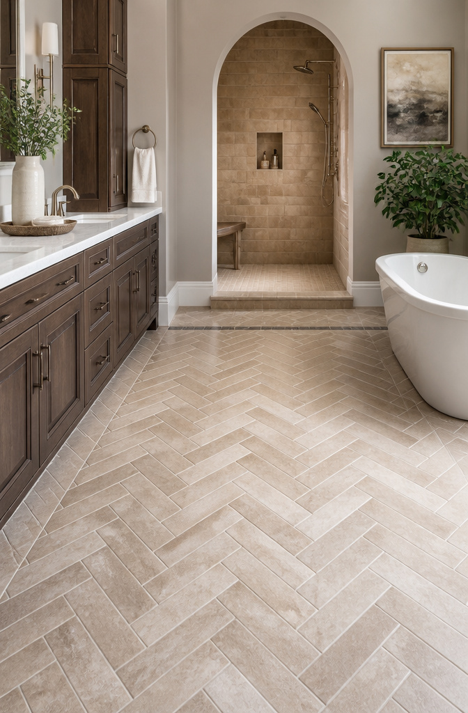
A herringbone layout asks every rectangular tile to meet the next at a 45-degree angle, staggered so the ends overlap like fish bones. The V-shaped lines pull the eye along the wall or floor, giving even a narrow bathroom a sense of motion that straight stacks never manage. That movement is architectural; the sources describe it as adding dimension through installation effort alone.
Labor runs higher because roughly thirty percent more tile gets cut to fill the edges, and the layout demands constant alignment checks. A pro installer is worth the cost here; the pattern betrays every fractional misstep, whereas a basic grid forgives it. Budget ceramic or porcelain, the kind that looks flat in a straight run, suddenly reads custom once the herringbone angle enters. The material cost stays low, the visual result does not. The tradeoff is time and skilled labor against the price of premium tile you would otherwise need to buy for the same effect.
14. Color Drenching
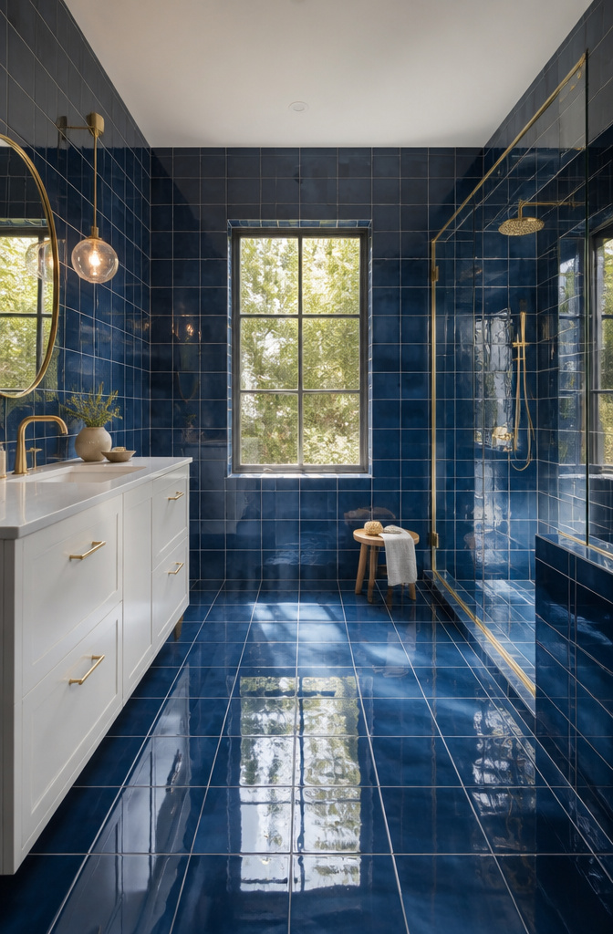
Color drenching asks you to pick one saturated hue and run it across every tiled surface, grout included. The effect is immersive in a way that feels closer to stepping inside a painted room than a tiled one, but that immersion only holds if you commit fully. A half step, like matching walls and floor while leaving the shower in white, reads as a mistake rather than a choice.
The finish matters more here than in any other all-tile approach. Glossy tile bounces light and keeps the color from feeling heavy, though it also multiplies reflections until the room can feel restless. Matte tile drinks the light instead, which deepens the saturation and can push a small bathroom toward cave-like if the color runs dark. Matte finish is the safer call for north-facing or windowless baths, where gloss turns garish under artificial light alone.
Grout color is the detail that separates a drench from a near-miss. Matching grout to tile erases the grid and lets the color read as a single skin. The downside comes later: any grout line that shifts or stains stands out like a crack in plaster, and regrouting means sourcing a color match years down the line. For a weekend project on a real budget, the commitment is total and the stakes are visible.
15. Mixed Materials
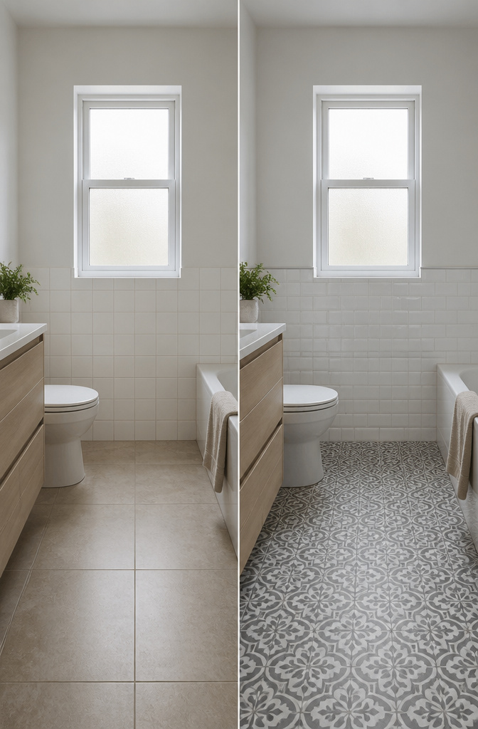
Mixing materials in a fully tiled bathroom stretches the budget further than running one tile everywhere. In the girls’ bathroom at House 15, the designers used large format floor tiles against Dulux Acratex render on the walls, a pairing that keeps the wet zone practical while saving on wall coverage where moisture is less relentless. The same logic applies to stone: real travertine or marble on the floor, where feet and water hit hardest, paired with stone-look porcelain on the walls for the visual continuity at roughly half the upkeep.
The transition between materials is where most weekend projects stall. A metal Schluter strip or a recessed grout joint handles the height difference cleanly; caulk alone cracks inside two seasons. Monique Hession’s contemporary bathroom mixed tiles with VJ panelling, which means the junction sits outside the shower splash zone entirely, a safer bet for anyone who has never set a waterproof membrane.
Microcement against tile adds another layer worth considering. The render catches light differently than ceramic, so the room reads as two textures rather than one finish trying too hard. The catch: microcement needs resealing every few years, while the tile beside it does not. Plan the maintenance into the layout, or the "all tile" look becomes the one wall that stains first.
16. Glossy vs. Matte Tiles

Glossy tiles bounce light around a small bathroom like nothing else. In my last place, the shower was tucked under a slope with one tiny window, and the glossy white ceramic on the back wall was the difference between gloomy and usable. The catch is that every water spot and soap streak shows up the moment they dry. I wiped that shower down twice a week minimum, sometimes more.
Matte tiles hide that same daily mess for days. The soft, diffused surface reads more contemporary too, and the improved slip resistance matters on floors where wet feet land. I would not put glossy anything underfoot unless the manufacturer specifically rates it for wet areas; the reflection is not worth the risk.
The move that actually looks designed, not accidental, is pairing the two. Glossy walls with a matte floor gives you the brightness where you need it and the grip where you must have it. A matte accent behind the vanity against glossy shower walls does the same thing with almost no extra cost per square foot. The contrast reads intentional, layered, like someone planned it rather than grabbing whatever was in stock.
17. Decorative Tiles
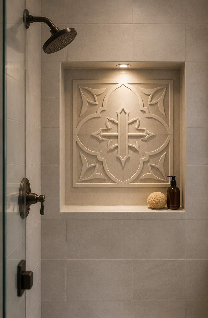
A single decorative tile with a raised cross pattern or a hand-painted motif does the heavy lifting only if you give it space to breathe. I learned this the hard way in a friend’s powder room where four different "accent" tiles fought each other across every wall. The fix was stripping three walls back to plain field tile and letting one wall of Travola Decor carry the room. The raised pattern gives you texture under morning light without demanding attention at midnight.
One bold tile belongs in one contained location: a shower niche, a backsplash behind the vanity, or a single feature wall opposite the door. Anywhere the eye lands naturally and nowhere else. Metallic inlays like the bronze tones in Enredo Steel Dark Brown read as jewelry, not wallpaper. Use them where water catches the gloss and throws light around a windowless shower, but keep the surrounding tile matte and quiet.
Hand-painted designs and Moroccan motifs reward the same restraint. The sources that pull this off treat the decorative tile as the tub’s counterpart, matching its color rather than adding a second pattern. If your tub is already doing the visual work, the tile’s job is to echo it, not compete. Skip the patterned floor. The eye needs a place to rest, and in a fully tiled room, that rest is the plain surface that frames the one piece with something to say.
18. Coastal Chic Styles
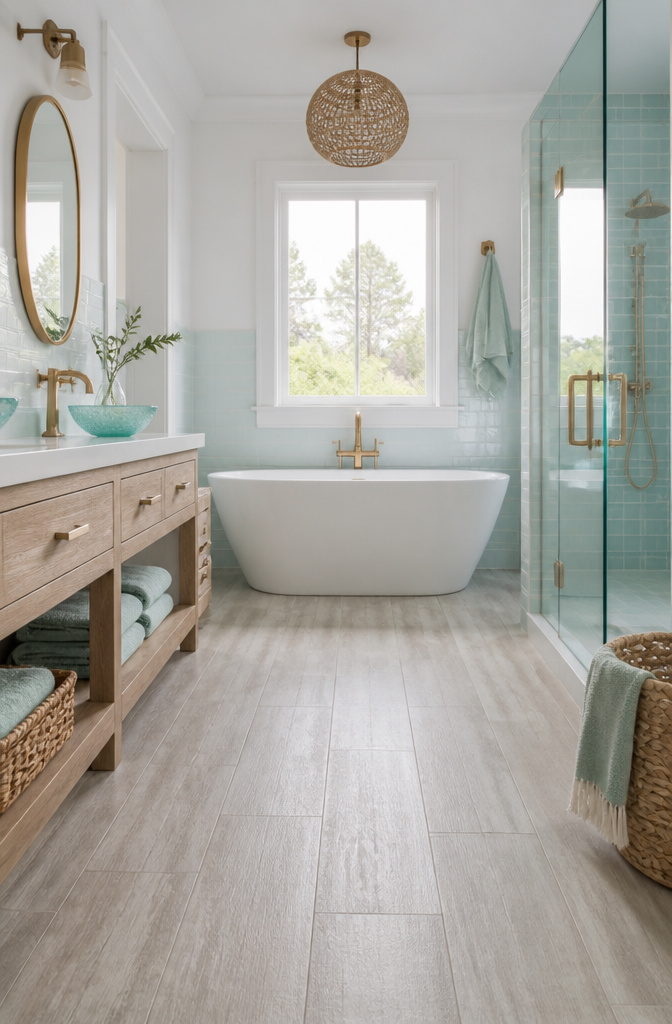
Soft blues, greens, and warm whites do the heavy lifting in a coastal bathroom, but the texture underneath those colors is what keeps the room from feeling like a seafood restaurant. Weathered wood-look porcelain or cement tile with a slightly irregular surface reads as sun-bleached dock or driftwood without needing a single anchor motif. I saw a bathroom that paired tonal blue plaid cement floor tile with warm white walls and wicker sconces, and the effect felt like a house that actually sits near water, not one trying to sell you a vacation package.
The line between evocative and themed is thinner than most people think. Natural materials help stay on the right side of it: recycled glass tile with a translucent finish catches light the way shallow water does, and up to 45 percent recycled content in some lines means the sustainability story is real, not pasted on. The Jeffrey Alan Marks Sand Dollar Ocean tile leans into this, pairing ocean tones with warm and cool whites so the palette does the coastal work without literal imagery.
If you catch yourself hunting for shell-shaped accent tiles, you have already crossed into theme territory. Stick to the colors and textures that exist in actual coastal architecture: bleached, salt-worn, sun-faded. The best all tile bathroom ideas in this style let the material speak and keep the nautical props in the gift shop where they belong.
19. Vintage-Inspired Tiles
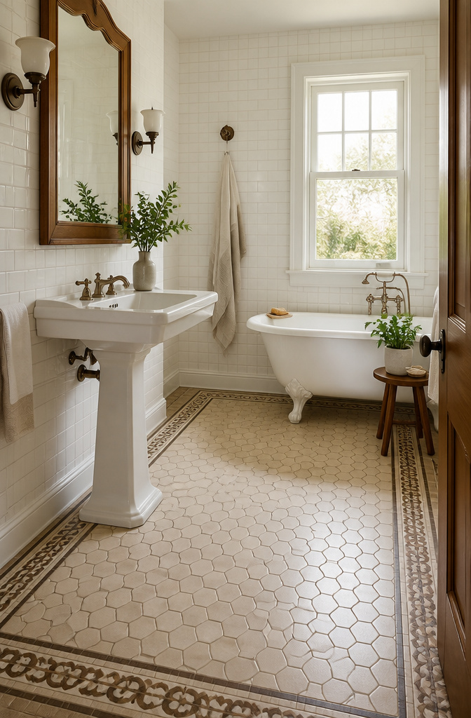
Reproduction hexagons and basketweave patterns carry the warmth of early 20th-century bathrooms without the cracked glaze and lead concerns of actual salvage. I spent an afternoon sorting through a salvage yard’s tile bins once and walked away convinced: the reproduction route wins for floors you actually stand on. Porcelain copies now fire dense enough to resist water and scratching, while the matte finishes keep that soft, organic feel underfoot. The Catalina 7×8 Hexagon in Mushroom is one example, a warm beige that pairs with natural wood without shouting for attention.
Decorative borders need the same practical check. Vintage White patterned tile, black-and-white floral inspired by historic designs, works when you anchor it with plain subway tile and keep the vanity simple. The pattern adds interest; the restraint keeps it from overwhelming a small bathroom. Smaller hex mosaics add slip resistance for shower floors, a detail worth the extra grout lines. Hunter Green 4-inch hexagons against sun-baked Tumbleweed walls show how color can push the vintage atmosphere without pastiche, though I’d limit that bold a floor to a powder room or a bathroom with generous natural light. Sourcing reality: true salvage demands lead testing, imperfect batches, and freight costs that erase any savings. Reproduction orders in standard sizes ship in two weeks and let you buy the 10% overage from the same dye lot.
20. Modern Farmhouse Styles
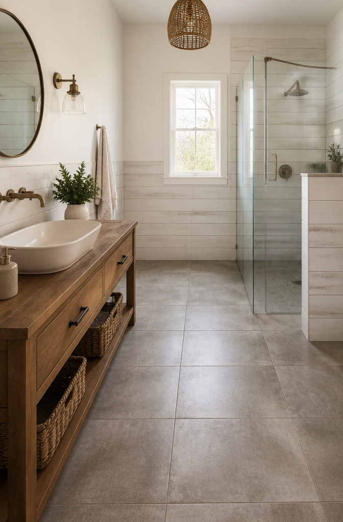
Shiplap-look tile gives you the clean horizontal lines that read as modern farmhouse without the swelling and warping real wood suffers in a bathroom. I like it run halfway up the wall with a pencil trim cap, not pushed to the ceiling where the repetition starts to feel like a set from a renovation show. Below that line, concrete-look porcelain on the floor grounds the room; the slight variation in tone keeps it from reading as a single slab of gray. The balance is in the contrast between those two textures, both of them matte, neither one trying to be the other.
Matte black fixtures are where this can tip into costume. The finish is flat and light-absorbing, which reads as deliberate against white or gray fields, but too many pieces in black and the bathroom starts to look like a catalog spread. Two black moments are usually enough: the shower hardware and one vanity light, or the faucet and a mirror frame. Spread them far enough apart that the eye travels.
Brick-look porcelain in a running bond or herringbone layout adds the rustic note the style demands, but the non-porous surface means you are not sealing real masonry every spring. The Marsden 3×10 in Almond, set herringbone, gives warmth without the terracotta heaviness that can feel like a pizza oven. Keep the grout close to the tile tone; high contrast here turns texture into pattern, and pattern fights the calm the rest of the room is building.
Frequently Asked Questions
What are the best tiles for bathroom floors?
Porcelain with a water absorption rate below 0.5% is the strongest choice for bathroom floors because it forms a waterproof envelope that handles steam, splatter, and standing water. Matte or grip-enhanced finishes keep the surface safe under wet feet, while the same tile in a smoother finish can climb the walls where traction matters less. Large format tiles also work well because fewer grout lines let the eye read the floor as one continuous plane.
How do I create a focal point with tiles?
Use bold patterns or vibrant colors on a single feature wall, shower niche, or splashback rather than scattering accents across every surface. One decorative tile like Travola Decor on one wall carries a room; four competing accent tiles fight each other and flatten the effect. Encaustic tiles with interlocking circles or starbursts, or a single mosaic wall in sea-glass blues or melon-pink, shift the whole mood without demanding attention at every hour.
Can I use the same tile for bathroom walls and floors?
Yes, if the tile is rated for floor use and has the right finish for each location. Running the same body of tile throughout, with grip-enhanced or matte underfoot and smoother on walls and ceiling, erases visual breaks and lets the room read as one continuous volume. The payoff is continuity: no paint line to stain, no caulk joint where materials meet, just the same surface wrapping every plane.
How do I clean and maintain bathroom tiles?
Use non-abrasive cleaners and stay on top of grout, since grout is where the look lives or dies in a steamy room. Epoxy grout costs more upfront but stays clean-looking for years because it resists water penetration. Textured tiles hide daily mess better than glossy ones, though deep relief collects soap film that needs brushing, not just wiping. Penetrating sealers on natural stone need reapplication at least once a year in a working bathroom, more often on shower floors where water sits.
What’s the difference between porcelain and ceramic tiles?
Porcelain is denser, less porous, and more water-resistant because it is fired at higher temperatures, giving it a harder, more durable surface that handles wear and wet areas like bathroom floors. Ceramic is more budget-friendly and slightly softer, making it easier to cut and install, but it works better on walls or in lower-moisture spots where durability is less crucial. The glaze on ceramic offers design flexibility, yet it cannot match porcelain’s toughness in high-traffic, wet zones.