

A mantel in 2026 ranges from a single salvaged barn beam to ceiling-height vertical displays, and the right choice depends on whether your fireplace actually works. Heat changes everything: LED candles with bottom-edge switches save you from disassembling the whole arrangement to swap batteries, and anything forward of the mantel plane needs to stay ceramic, glass, or untreated natural material within 18 inches of the opening. The £12 velvet-textured ornaments that read as vintage from across the room belong at eye level where hands reach; manufactured vintage pieces do their job higher up, woven into garland where eyes sweep across without pausing to compare patinas.
1. Magnolia-Filled Mantel

Fresh magnolia leaves read as quintessentially Southern greenery, and that difference from standard evergreen is what makes a mantel feel considered rather than default. The bright green reads crisp against white or pale gray walls, turns moody against deep navy or charcoal, and warms up flat beige in a way pine never quite manages. Faux branches work if your room runs hot or you need the look to last from Thanksgiving through New Year’s; the color just needs to lean toward that same saturated green, not the dusty version sold for general craft use.
What holds everything in place without scratching the mantel surface matters more than the arrangement itself. A row of clear glass cylinder vases, low and heavy, anchors stems without visible mechanics. For branches that need to angle outward, museum putty or reusable mounting wax behind the vase base keeps the whole grouping from shifting when the heat kicks on. Weight in the vessel matters more than tape on the stem. A scratched mantel is what you remember in January; the greenery is what guests notice in December.
2. Maximalist Mantel
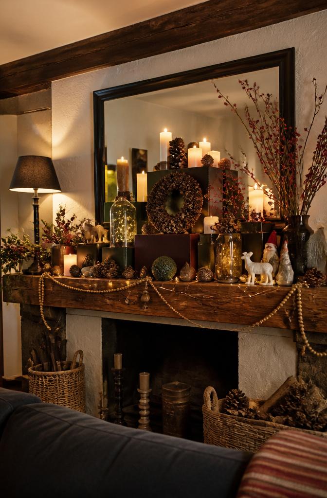
Maximalist mantels work because the eye reads density as abundance, not clutter, when every object has its own plane. What separates the look from a pile is three distinct depth layers: the wall plane itself, a middle shelf of varying heights, and forward accents that sit on the mantel ledge or just over it. Start with the back wall, not the ledge. A tall mirror, leaning art, or even a grid of small frames pinned with removable strips gives the stack something to build against. Then set the middle layer: candlesticks, small trees, or stacked books staggered so nothing lines up dead center. The front layer is where the movement happens. Pine cones, figurines, or a strand of beads drape forward but never past the fireplace opening itself.
The fire hazard is real and specific. Anything forward of the mantel plane heats up faster than you expect once the flue draws, and synthetic greens or high-gloss finishes can off-gas or warp. Keep the front layer to ceramics, glass, or untreated natural materials within 18 inches of the opening, and nothing should overhang the firebox edge at all. Layered right, the density reads as intentional because the sight lines stay clear from the seating angle. Sit on your sofa and check: if one object blocks another entirely, shift it sideways, not back.
3. Makeshift Mantel
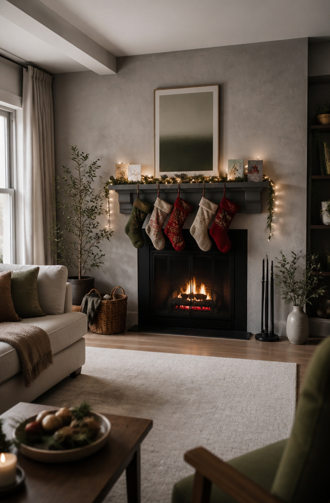
A floating shelf with at least six inches of depth gives stockings something to grip and garland enough ledge to drape without looking like a tightrope. The bracket type matters more than the wood finish: concealed wall cleats spread weight across studs, while L-brackets underneath read as hardware store afterthoughts. For renters, a ledge screwed into wall studs through the drywall can be patched with a $4 tube of spackle when the lease ends; adhesive-only strips fail the moment someone tugs a stocking.
The trick to faking a focal point is treating the shelf as if it were original architecture. Paint it the same shade as surrounding trim so it visually belongs, not like a floating add-on. I have seen shallow picture ledges used in apartments where even a full shelf felt like too much commitment; they hold a single strand of lights and a row of cards, nothing more, but the eye reads it as a mantel because the grouping is centered and symmetrical.
Height sets the illusion too. Eye level, roughly 55–60 inches from the floor to the shelf top, matches where traditional mantels sit. Go higher and the stockings hang awkwardly low; go lower and the arrangement competes with furniture backs. In my last rental, a barn beam from a salvage yard ran $38 and spanned the full wall width. Two coats of matte black paint, three screws into studs, and it read as intentional from across the room. The landlord never noticed the holes were larger than a nail hole; the spackle took ten minutes at move-out.
4. Cozy Orange-Themed Vignette
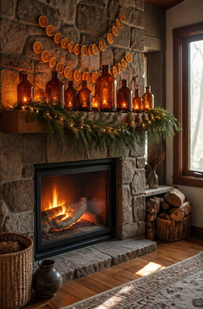
Amber glass bottles catch firelight in a way clear ones never do, and that warmth is what keeps orange on the Christmas side of the line. Dried orange slices strung across the mantel echo the glow, but pair them with copper, not black iron, or the whole vignette slides toward Halloween. I learned that the hard way one year when candleholders with too much scrollwork made the living room look like October had overstayed.
The trick is keeping the palette tight. Amber, copper, and the pale gold of dried citrus read as harvest and hearth; add even a single black element and the eye starts reading spooky. Warm white fairy lights behind the glass help, especially if you cluster them low where the flame would sit rather than draping them high like a garland. A single strand of fresh greenery, something with silver undersides like olive or eucalyptus, bridges the gap between autumn and December without fighting the color story.
Stone walls help enormously here, absorbing some of the intensity and grounding the display. On painted drywall the same grouping can feel like a craft project, so I keep the scale modest: three to five amber pieces, two copper candleholders, and the orange slices as the single horizontal line. Anything more and the mantel becomes a pumpkin patch.
5. Mantel Bowfest

Bows look generous on a mantel until you step back to sofa distance and half of them vanish. Ribbons under four inches wide disappear against garland; the ones that read from across the room start at six inches and climb to ten or twelve for a single statement bow. I learned this spacing the hard way, clustering three-inch loops above my fireplace and wondering why the mantel still looked bare in photos.
Wired ribbon earns its higher price on mantels because it holds a creased shape through heating season. Unwired satin collapses after a week of radiator warmth; wired edges let you refluff a bow in seconds without retying it. The Anthropologie holiday setup that made this trend visible used oversized satin bows at staggered heights, some tied directly into garland wire, others hung from clear fishing line so they float slightly forward. The stagger matters more than the count: three bows at six, eight, and ten inches high draw the eye upward better than five at identical heights, which flatten into a stripe.
Standalone bows need weight or they spin. A loop of floral wire through the back, hooked over a nail or tucked between mantel bricks, keeps the face forward. If your mantel has no ledge depth for anchoring, the garland itself becomes the bow’s infrastructure; tie the knot around two branches, not one, so a single bare spot doesn’t loosen the whole thing.
6. Berry Red Vignette
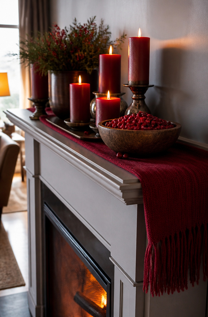
Berry red reads louder on a mantel than most palettes dare, so the trick is committing all the way or the saturation falls flat. Cluster faux cranberries in a low wooden bowl, flank them with crimson pillar candles in staggered heights, and drape a deep red wool throw or table runner along the mantel edge so the textile catches light below the arrangement. The single-color discipline matters; one green sprig or gold accent breaks the spell and the whole thing becomes generic Christmas.
Fresh berries stain mantels and fingers alike, and the juice seeps into grout and paint faster than you’d think. Faux versions solve that but bring their own problem: cheap ones photograph chalky and read as plastic from across the room. The ones worth buying have a matte, slightly dimpled surface and color variation from brick to wine within the same cluster. Hold them next to a real cranberry in the store; if the fake berry reflects light like a gumball, skip it.
7. Heavenward Mantel Display

Vertical lines pull the eye up, which makes a room feel taller than its walls actually allow. A garland hung from the top of a round mirror, not draped across the mantel shelf, starts that motion at eye level and keeps it climbing. Tall metallic candlesticks do the same work without any ceiling attachment, their height measured against the mirror or the trim rather than the mantel itself.
Ceiling height below nine feet is where this trick either pays off or backfires. In an eight-foot room, a mirror-mounted garland plus ascending candlesticks can crowd the vertical space and make the ceiling feel lower, not higher. The move that works there is a single strong line, one bough of garland strung along the ceiling trim with vertical-running lights beneath it, so the eye travels up but the middle of the wall stays open. Above nine feet, you can layer both: the ceiling-trim garland and the mirror-hung strand together, since the extra air above absorbs the busyness. The lit tree shapes in metallic finishes add shimmer at the mantel level without adding more vertical weight; they catch light and move the eye sideways just enough to keep the display from reading as a narrow column.
8. Fresh Mantel Display
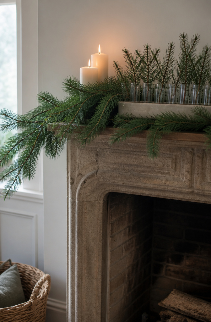
Fresh greenery on a mantel usually browns before the second week of December, which makes the whole room feel tired before the holiday even arrives. Fraser fir, white pine, and boxwood hold their needles longest indoors, staying workable through Christmas if you choose stems with firm, dark color at the purchase point and recut the bases the same day. Water is the problem most people solve wrong. Open containers on wood mantels leave rings that sink past the finish; I use narrow glass tubes tucked behind the display, or dampened florist foam wrapped in dark wax paper and set on a ceramic tray. The tray catches what the paper misses, and the green stays full without the mantel taking damage you will notice in January.
9. Candlelight Mantel Trick
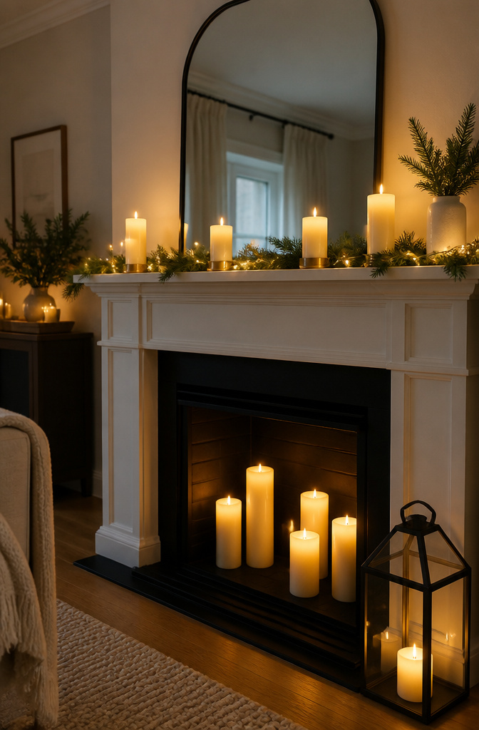
Real candles on a mantel look beautiful until you notice the soot creeping up the brick. LED pillars solve the smoke problem completely, but most setups ignore how you’ll reach the battery compartment once garland and stockings are in place. I look for candles with the switch on the bottom edge, not buried under a glued-on base, because disassembling a whole mantel arrangement in January just to swap AAs is not how anyone wants to spend an evening.
Spacing matters more with real flame, though LED versions still need breathing room to read as individual points of light rather than a solid block of cheap plastic. Six inches between pillars is the minimum for that flicker to register separately. Behind them, a simple mirror or even a sheet of white poster board angled against the wall catches the glow and throws it back into the room. The reflector does not need to be pretty; it needs to face the right direction, which is toward the seating area and not toward the ceiling where the light dies.
Battery access is the detail that separates a display you can live with from one you abandon by December 15. Before you buy, flip the candle over and ask whether you can change cells with one hand while the other steadies a wreath.
10. Traditional Mantel Display
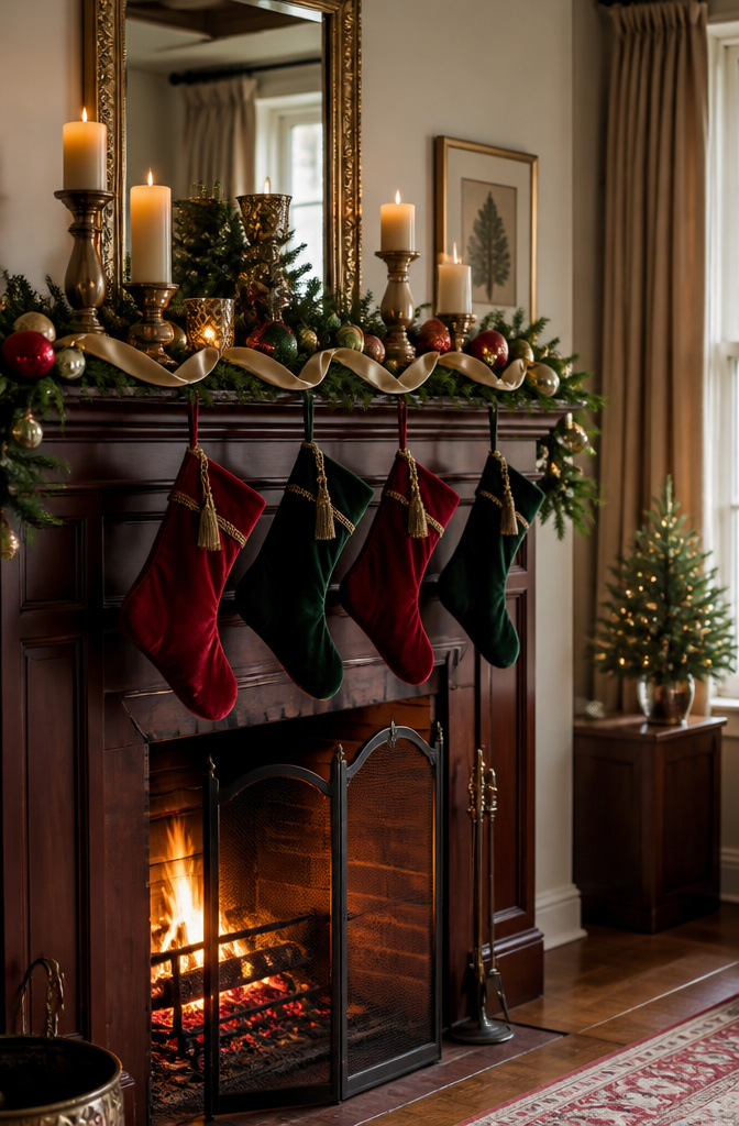
Most Christmas mantels start here for a reason. The combination of stockings, candles, and vintage-style ornaments became the default because it works in nearly every room, rented or owned, without demanding a particular architecture. Velvet textures in deep reds and greens, Nutcracker figures, and candles staggered at different heights deliver the cosy glow people picture when they picture Christmas. The handmade feel of older ornaments helps, too; something that looks passed down softens the edges of a space that might otherwise read as temporary.
Where this display goes stale is when every element looks inherited rather than chosen. The trick is updating one piece while keeping the rest traditional. A generous addition of red faux leaf sprigs through the garland, for instance, keeps the red-and-green palette intact but shifts the texture from expected to deliberate. One modern gesture is enough; more than that, and the mantel starts performing instead of feeling lived-in. The candles stay, the stockings stay, but that single swap tells visitors someone made choices here.
11. Sultry Red Mantel

Deep reds read richer than berry tones when you push toward burgundy and oxblood, almost to the edge of black. Those shades absorb light instead of reflecting it, which becomes a real problem by four o’clock on a December afternoon. The mantel can flatten into a dark stripe against the wall unless you build in brightness deliberately.
I learned this the winter I tried to match a pair of wine-colored velvet stockings. The fabric looked luxurious at noon and disappeared by dusk. Now I place any dark red pieces in front of a working light source, not beside it. A clip light tucked behind a garland, aimed upward, does more than candles alone. Candles read warm but throw almost no useful light; they register as extra dots of orange rather than illumination.
Metallic helps too, though I keep it spare. A few brass candlesticks or a thin gold frame catch what light exists and bounce it back into the red. Too much metallic and the mood shifts to holiday party instead of sultry.
For garland, dried eucalyptus sprayed in oxblood holds the depth without going flat, and the gray-green stems provide natural contrast. Fresh greenery against deep red tends to look like traditional Christmas by accident; the muted, dusty version keeps the tone intentional.
12. Merry Mantel

Miniature Christmas trees in varying colours and heights do the heavy lifting here, and the spacing between them matters more than the trees themselves. Cluster three or four across the mantel with at least a hand’s width between each trunk so every silhouette reads as its own shape; any tighter and the eye glazes them into one lump. Nutcracker figures work best tucked into the gaps, standing guard rather than marching in formation. Small gifts or favors, wrapped in paper that picks up one of the tree colours, finish the scene without demanding their own spotlight.
The line between merry and messy sits at about five competing elements per running foot of mantel. Go past that and the arrangement starts reading as clutter no matter how charming each piece is on its own. Last year I set six trees on a four-foot mantel and spent the evening shifting them like chess pieces until two went to the side table instead. The version that stayed felt lighter and the individual trees actually got noticed.
Lights woven through help, but keep them sparse. A single strand of warm white, looped rather than wrapped, lets the shapes stay sharp after dark.
13. Snowy Mantel

White flocking on garland looks like fresh snowfall, but the polyester fibers shed every time the heat kicks on. A weekly vacuum with the brush attachment keeps the dust down, though you will still find glitter in the carpet come March. Cotton batting builds softer drifts along the mantel ledge and around candle bases, yet it pills and yellows where the air gets dry; layering it over wax paper makes the whole scene removable for cleaning. Bleached botanicals, wheat stalks or dried hydrangeas dipped in diluted paint, give the same pale hush without the synthetic fallout. They shed too, just differently: tiny flakes of plant matter that read as dust bunnies, not sparkle. For a rental mantel I would skip the flocking entirely. The batting comes down in one piece, and the bleached stems store in a shoebox until next year.
14. Patterned Mantel
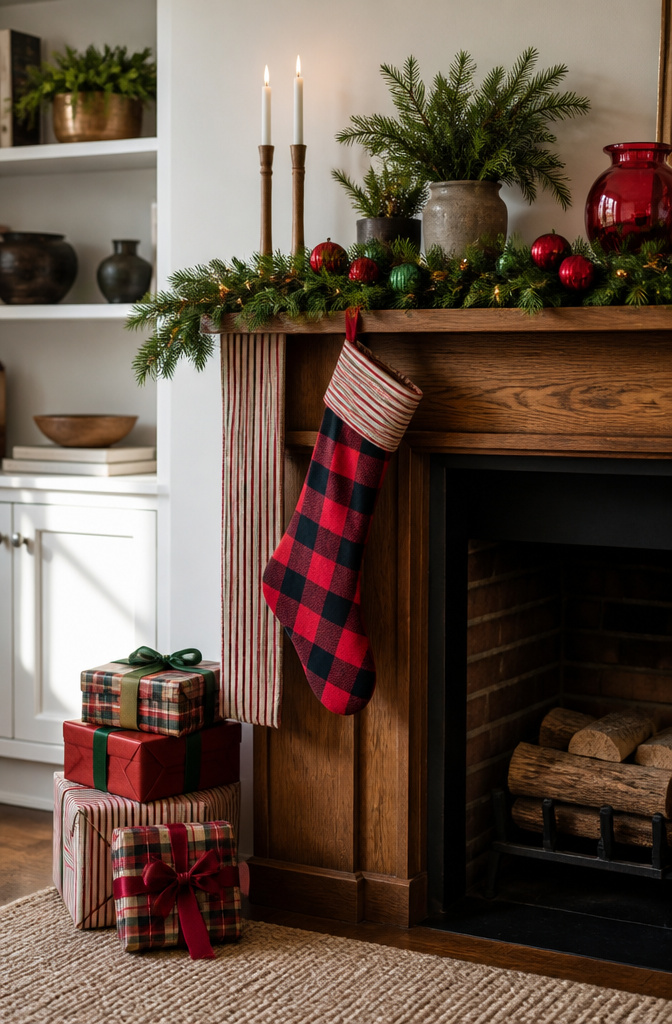
Plaid on plaid sounds like a risk until you see it work. Last year I layered a buffalo-check stocking over a thinner stripe runner and expected a mess, but the shared red thread held them together. The trick is one pattern family per surface, varied in scale. A large-scale plaid on the boxes, a medium stripe on the runner, a small botanical on a single accent stocking. Two large plaids of similar size fight each other; two identical prints read as a mistake, not a choice.
Repetition keeps the budget in check. I bought three yards of one plaid flannel, cut it into runner-length strips, and wrapped the rest around empty boxes. The fabric cost less than two premade stockings and covered the whole mantel. Stripes and botanicals work the same way: one yard of each, cut and layered, looks intentional because the repeats echo across the display. The eye reads the pattern rhythm before it notices the material is cheap.
15. Vintage Mantel
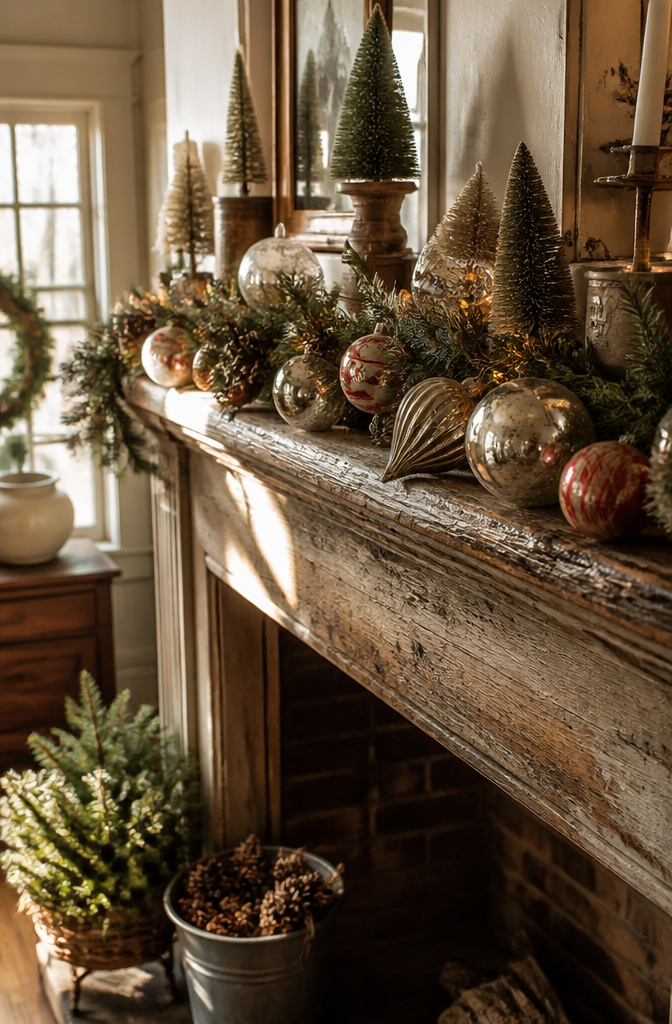
Vintage-style ornaments with a handmade feel sit best where the eye lingers, not where a guest can inspect them up close. The £12 pieces from the Christmas Cabin range carry that soft velvet texture and rich color that reads as old from across the room, which is exactly what a mantel needs: something that telegraphs warmth at a distance.
I learned the hard way that authentically old and artificially aged serve different functions on the same shelf. An actual thrifted mercury glass ornament, dug out of a bin for pocket change, has the irregularities that hold real light differently. The pitting, the wear on the cap, the slight lean to its shape: those details reward the second glance. Put that piece at eye level, where someone adjusting a stocking or reaching for the nutcracker will pause and notice.
The manufactured vintage piece, the one with the deliberate handmade feel, works higher up or deeper in the garland, where it contributes to overall texture without inviting scrutiny. The £20 Vintage Soirée glittery silver light-up tree is doing exactly this: retro glamour from a distance, metallic glow woven through faux foliage, not sitting solo where someone might compare its perfect glitter to the real patina beside it.
The mistake is mixing them at the same focal point, which makes both look like costumes. Choose the mantel’s center for one or the other. Authentic old pieces belong where hands reach; manufactured vintage belongs where eyes sweep across.
16. Modern Mantel

Geometric shapes read cold fast. A row of white ceramic triangles or black metal arcs can look like a clearance shelf if the spacing is even and the palette stays too tight. The mistake is treating restraint as a license to buy less instead of a reason to choose bigger.
One oversized piece fixes the empty problem. A 24-inch matte black ring, a single concrete sphere, or a thick walnut slab leaning against the wall gives the eye a place to land. Everything else stays small and stays few: maybe three objects total, none matching, all sharing either warm undertones or cool ones but never both. Negative space works when it frames something, not when it fills the gap between leftovers.
I tried the scattered-minimal look two years ago and ended with what my sister called "the waiting room effect." The next attempt, one ebonized oak circle about the diameter of a dinner plate, flanked by nothing but a slim brass taper holder, finally looked intentional. The shapes were still simple. The difference was scale.
17. Rustic Mantel Moment
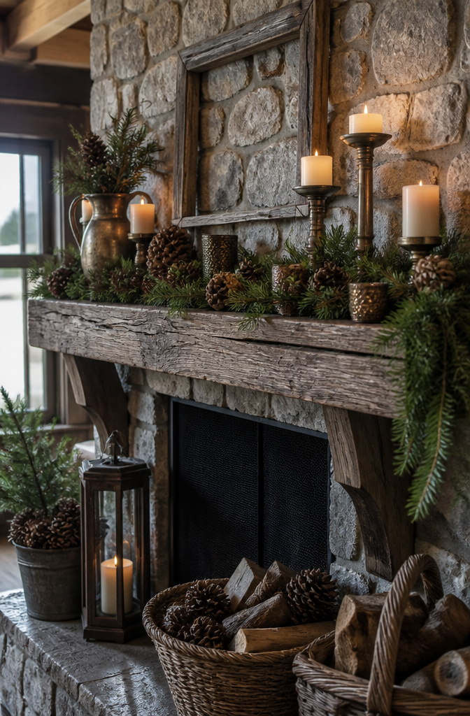
Raw wood, burlap, pinecones, and unpolished metal give a mantel its texture before anything else gets arranged. The trick is knowing where rustic ends and unfinished begins. A single smooth factory-rustic piece, something with that artificially even distressing, will undo the whole display because the eye catches the lie before it registers anything else.
I learned this the hard way one December with a set of "weathered" candlesticks that turned out to be resin with a printed grain pattern. They sat on the mantel for two days before I admitted they were reading as plastic against actual split birch and hand-woven burlap. Swap one factory piece for the real imperfect thing, even if that means a rusted nail driven through a scrap of barn wood as a hook, and the whole line holds together.
Pinecones work best when they still have sap residue and uneven scales, not the bleached and opened ones sold in craft bags. Unpolished iron or blackened steel catches firelight without reflecting it back like chrome would. The metal should look like it came from a hardware drawer, not a design shop. If every surface tells the same story of use and time, the mantel reads as collected rather than staged, and that is the difference between rustic and merely rough.
18. Heightened Mantel
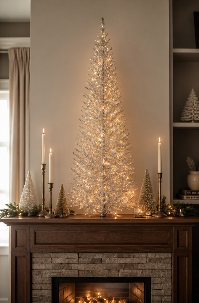
A glittery silver light-up tree can anchor a mantel the way nothing else does, but the piece has to earn its height without stealing the whole wall. I look for something that clears the mantel by at least a third again, so a 12-inch mantel wants a 16-inch tree minimum, though much taller starts to feel like a room divider instead of a display. The cord is the part that breaks the spell, so I run it behind the garland if the outlet sits close, or tuck a slim extension along the back edge painted to match the mantel itself. Proportion to the mantel length matters more than height alone: a tree wider than half the mantel will overhang the edges and read as crowded from every angle, especially on the shorter 36-inch mantels common in postwar rentals. Leave six inches of breathing room on each side, or the piece starts looking like it landed there by accident rather than choice.
19. Colorful Mantel
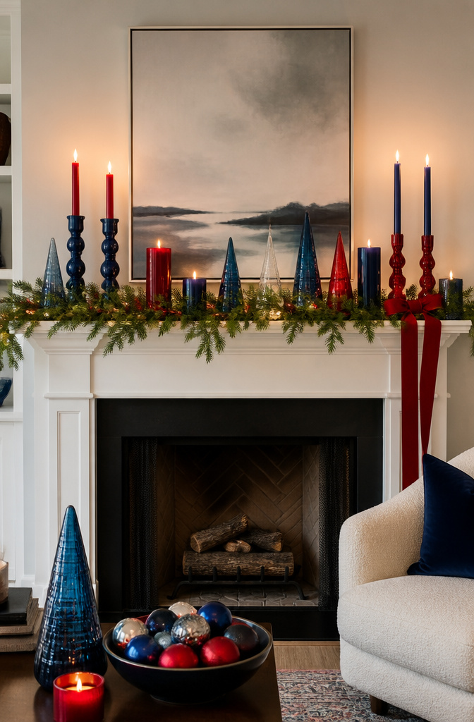
A mantel in two colors reads as intentional; three is where it gets interesting. The ceiling sits at two to three colors, not four, and the difference between a scheme that holds together and one that looks like leftover ribbon from three Christmases ago is repetition.
Pick a unifying element and run it through every hue. Sources show this working with shape: berry red orbs echoed in matching candlesticks, or jars of candy amplifying stockings in the same two tones. The object repeats, the color shifts. That rhythm lets blue and red coexist without fighting, or lets a cooler palette warm up beside the fire.
What fails is treating the mantel as a display of every ornament you own. A multi-color scheme needs editing the same way a single-color one does. Choose the colors, then choose the shape that carries them. Glass cones, spheres, even simple cylinders can bridge disparate hues if they repeat often enough.
The fire itself becomes part of the palette here. Cool blues against orange flame, warm reds against dark hearth stone: the contrast is built in, so you do not need to force it with more colors on the shelf.
20. High-Volume Mantel
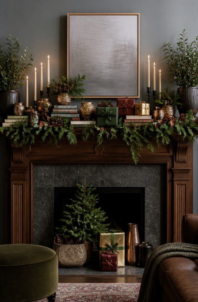
A mantel crammed edge to edge reads festive from across the room, but up close it turns into noise without somewhere for the eye to land. I learned this the hard way one December when every candlestick, bottle brush tree, and strand of beads I owned went up at once. The fix was simpler than tearing it all down. I pulled everything off, then rebuilt with one deliberate empty zone dead center, about the width of a hardback book. That gap became the visual anchor that let the surrounding density feel intentional rather than chaotic.
The rest of the run stays full: stacked books, taper clusters, a garland draped forward so it almost spills. The empty zone only works if it sits slightly off true center, maybe an inch or two toward the side with less height. Perfect symmetry makes the gap look like a missing piece; a little lean makes it look like breathing room you chose. I keep the densest layering to the ends and let the middle hold one quiet object, a single brass bell or a plain ceramic sphere, so the eye has permission to rest before it moves on.
Frequently Asked Questions
What are some Christmas mantel decor ideas?
Try a magnolia-filled mantel for crisp Southern greenery, a maximalist display built in three depth layers, or a cozy orange vignette using amber glass and copper accents. Other options include a bow-heavy garland with oversized wired ribbon, a vertical heavenward display that draws the eye upward, or a modern mantel anchored by one oversized geometric piece. The article covers twenty distinct approaches ranging from traditional red-and-green to snowy white flocking and rustic raw wood.
How can I make my mantelpiece festive?
Treat the mantel as architecture rather than an afterthought: center your grouping at eye level, roughly 55–60 inches from the floor, and build outward with garland, candles, or stockings. For renters, a floating shelf or barn beam screwed into studs creates a focal point that spackle repairs at move-out. Keep scale appropriate to your wall; a single strong vertical line works in rooms with eight-foot ceilings, while taller spaces can handle layered density without crowding.