Plum is a deep purple with red undertones, and that red keeps it warm enough to act almost like a neutral. It goes heavy fast, though.
Pairing it with soft gray or blue-gray, and skipping pure white, keeps it calm. For renters, a $13 IKEA lamp or a vase of dahlias is the cheapest test.
Small Decor Pieces
Small pieces are the safest first step for renters: no paint, no drilling, and everything fits in a box when the lease ends.
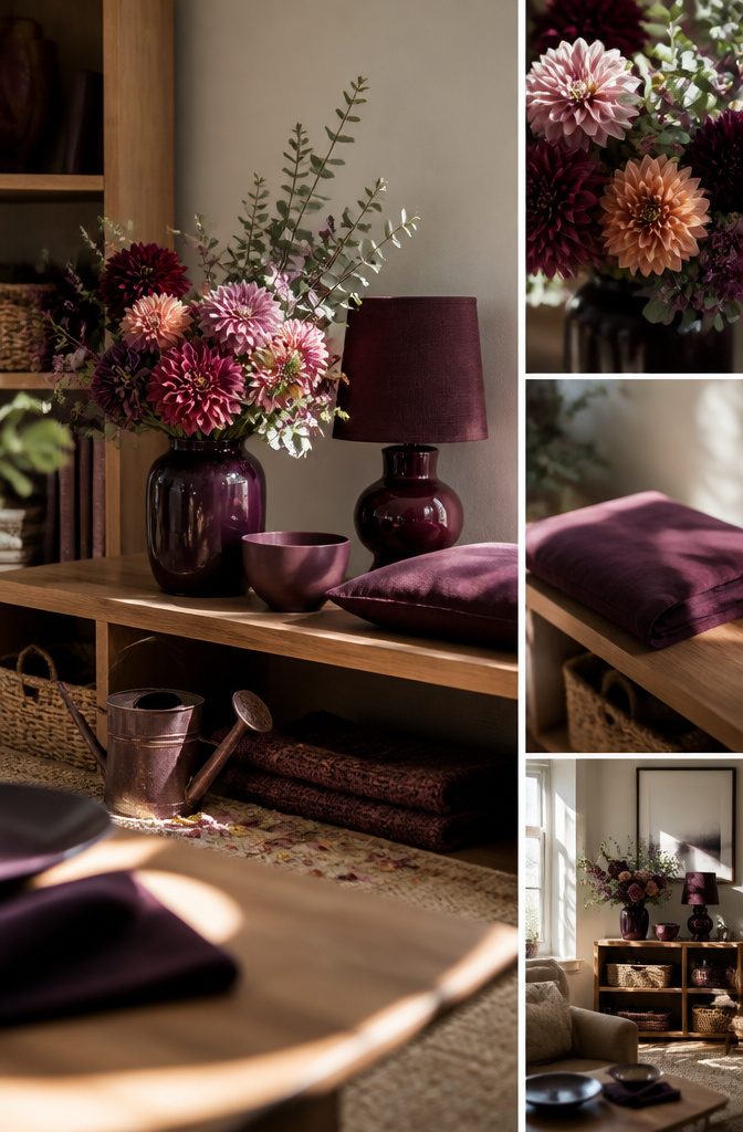
A vase of deep-hued dahlias is the cheapest test. Pairing them with pink and peach dahlias, chrysanthemums and a few branches of silvered greenery keeps the plum from feeling heavy.
For something that outlasts the blooms, the Tokabo Table Lamp is $13 at IKEA, the Trends Lotus Bowl is $36 at Design Public, and Purple Ogee Pillowcases are $40 from Plover Organic.
The $138 Peacock Pillow from Luru Home is the splurge. I’d hold off on it until the cheaper pieces prove you like living with the color.
Set them on a mantel, open shelf, bookshelf or table setting, grouping two or three plum pieces together, since a single one looks lost.
Plum Walls and Millwork
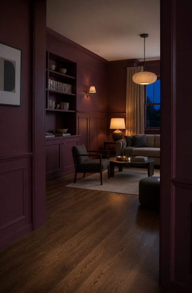
Plum walls suit rooms you use at night, and bookshelves, wainscoting, cabinets, tile and brick take the shade well when a full repaint feels like too much. Light decides how it lands:
Depending on your space’s light filtration, you might find the shade brings an elegant amount of drama or imparts softness.
Check the wall at noon and again after dark before you commit.
A powder bath or mudroom is the easiest place to color-drench. Deep shades need at least 3 layers of lighting, with a hanging fixture or chandelier among them.
Renters can skip paint: Farrow & Ball’s Lotus BP 2065 wallpaper is $305. For plum on a large scale, I’d hire a decorator or color consultant, because a half-committed plum turns insipid.
Colors That Pair With Plum
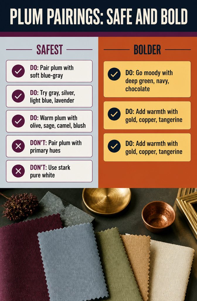
Most of these pairings are quiet; the last few get dramatic.
Safest
- Soft blue-gray, especially on cabinetry, keeps plum from feeling heavy.
- Gray, soft gray, silver, light blue and lavender are low-risk neighbors.
- Olive, sage, camel, blush, dusty rose and warm cream take the seriousness out of a deep shade.
- Greens work too. I’d skip primary hues, and skip pure white, which is too stark against plum. Farrow & Ball’s Skimming Stone has a bit of magenta and sits better beside it.
Bolder
- Deep green, navy and chocolate brown lean into plum’s moody side.
- Gold, copper, tangerine and wheat add warmth. West Elm’s raisin, gray and gold bedding shows how well that trio works, and gray keeps it calm.
One Plum Hero Piece
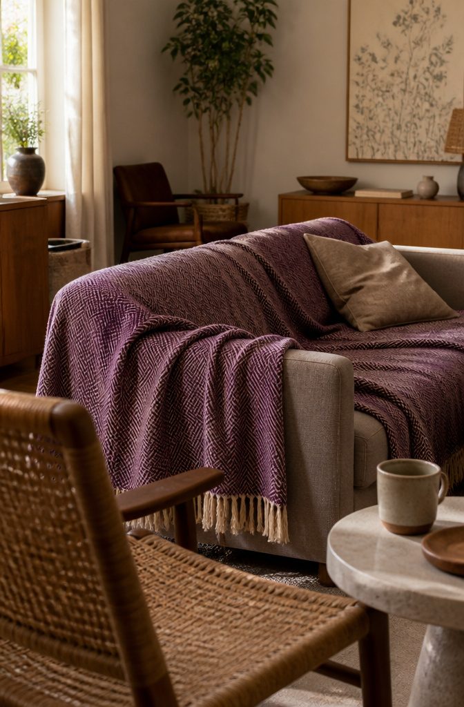
Let one plum piece carry the room: draperies, a sofa, or a pair of chairs. Treat it as the base color rather than an accent.
Rich, textured fabrics like silk and velvet suit plum best, while plain linen or a tight, flat weave can leave it looking dull. Around it, warm woods, woven fibers, stone, leather, and aged or unlacquered brass keep the richness grounded.
Cost is the catch. The Skye Sofa from EQ3 runs $1,699, the Saarinen Executive Chair from Design Within Reach is $1,614, and even the Carmen Ceramic Stool from Annie Selke is $687.
None of that fits a weekend budget. For most renters I’d start with the Lightweight Herringbone Throw from Evangeline at $251, draped over a neutral sofa or chair.
How Plum Reads in a Room
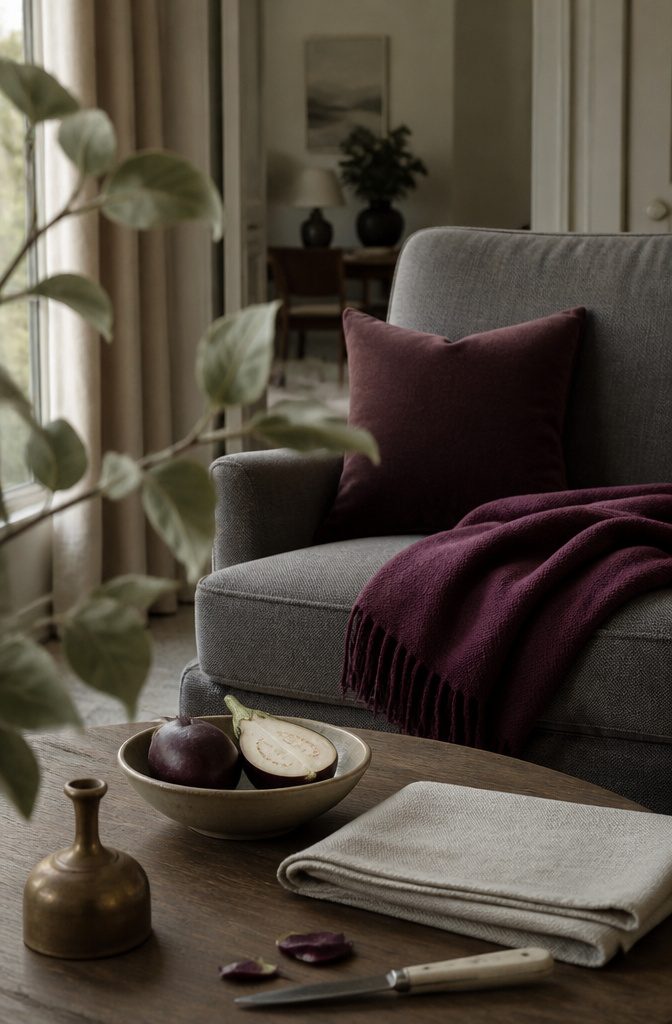
Plum is a deep purple with reddish undertones, and that red keeps it warm. It reads moody, cocooning and a little luxurious, yet it is earthy enough to behave almost like a neutral.
Next to gray, a dusty plum turns quiet and sophisticated, so choose a muted plum with gray when you want calm rather than drama.
The luxury reading is old.
Tyrian purple came from Murex sea snails, and 250,000 shells made only half an ounce of dye, which kept purple in the hands of the wealthy and powerful. "Plum" was first recorded as a color name in 1805.
For palette ideas, I’d head to the produce aisle. A ripe plum or an eggplant shows how the shade shifts with light, skin and shadow, and the colors beside it on the shelf make ready-made pairings.
Choosing Your Plum Shade
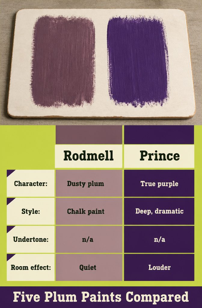
A muddy plum with brown in the undertone looks more natural than a clean, synthetic one. Dusty plum also sits quieter in a room than royal purple, which is the louder choice.
Five named paints cover the range:
| Paint | Brand | Description | Undertone |
|---|---|---|---|
| Gooseberry | PPG | Dark plum | Rose |
| Prince | Clare Paints | Deep, dramatic true purple | n/a |
| Pelt | Farrow & Ball | Regal eggplant, nearly black in dark spaces | Blue tint |
| Rodmell | Annie Sloan | Dusty plum, chalk paint | n/a |
| Pinch of Spice | Benjamin Moore | Deep purple | Red and black |
Prince is the royal-purple end of the list, and Rodmell is the dusty end.