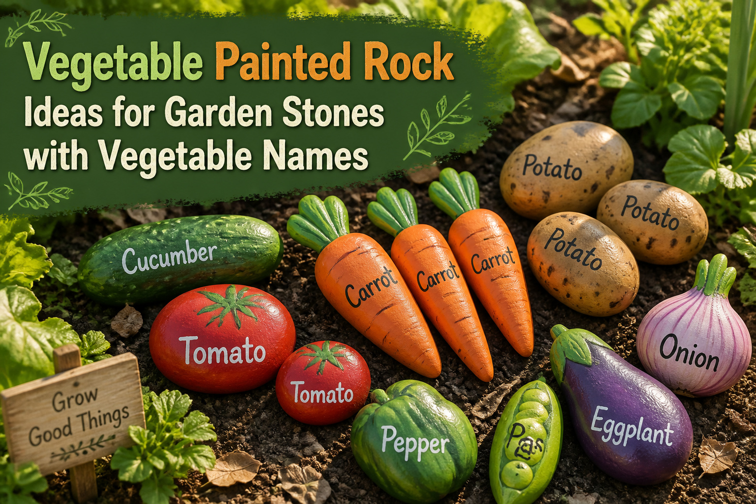
Finding the right stone shape matters more than painting skill for painted garden stones with vegetable names. A smooth, elongated rock narrows into a carrot before orange paint touches it, while the worst-shaped, lumpiest stones in the pile become the most convincing potatoes. The only catch is rushing the green tops; wet paint bleeds into orange and ruins the buffer if you do not wait for full drying.
1. Carrot Rock

A smooth, elongated stone does most of the work for you here. The natural taper from a wider base to a narrower tip already reads as carrot-shaped before any paint touches it, so hunt for a stone that narrows like a teardrop rather than forcing the illusion onto something round or blocky.
I lay down two coats of clean orange first, letting each dry until the surface turns matte rather than tacky. For the leafy top, a quick band of bright green across the wide end reads clearer than trying to paint individual fronds; the eye fills in the detail from a distance. A thin line of darker orange or raw umber dragged from tip to base with a dry brush gives the root its lengthwise texture without overworking it.
The green can bleed into wet orange if you rush, so either wait the full dry time or keep a quarter-inch of bare stone between the colors as a buffer. I have learned that one the hard way.
2. Squash Rock

A squash rock needs a wider, flatter stone rather than a tall one to catch that low, spreading shape. The wrong rock turns the whole thing into a balloon on a stick.
Soft yellow covers most of the body, blended or left flat depending on how cartoonish the rest of the garden stones run. A stem end in green, darker at the crease where it meets the fruit, gives it weight. The ruffled leaf shapes from mustard greens painting work here too if you want a vine trailing off, though I keep squash simpler since the name label already reads busy against the curve.
Paint the name along the belly, not across the top. The flat face lets the letters sit level, and a tall stone would force them vertical like a banner. That is the mistake that wastes the first hour, and the second coat does not fix it.
3. Corn Rock

A smooth, oblong stone works best for corn, though one with slight ribbing or texture saves you from painting every kernel by hand. Bright yellow covers the body, and a strip of green at the top stands in for the husk. The ribbed surface catches light like real kernel rows if you angle the stone under a lamp before you start, which helps you see which ridges to highlight and which to leave in shadow.
I used a flat brush for the base yellow and a thin liner for the pale lines between kernel rows, but a dry-brushed white or cream over the raised texture does almost the same work faster. The green husk gets two tones: a darker base and a lighter edge where the light would hit. A stone too smooth shows brush marks; one too rough swallows the fine lines. Aim for the middle ground you find in river rocks or broken concrete chunks from a garden bed.
The name "CORN" goes on the back or the bottom edge, since the front reads clearly enough without words. Seal it with exterior matte so the yellow stays bright through a summer of sun.
4. Pea Pod Rock

Long, narrow stones work best for a pea pod because the shape does half the design for you. I look for river rocks that taper slightly at one end, maybe four to six inches long and flat enough to sit steady in soil without rolling.
Paint the whole stone a medium green, nothing fancy, just a couple coats of acrylic craft paint. Once that dries, add a thin seam line down the center with slightly darker green or even a soft gray. The seam is what sells it as a pod rather than a green blob.
For the peas, five small round bumps in a lighter, yellowish green nestle inside that seam line. A cotton swab dabbed in paint makes the perfect size circle without needing a brush steady enough for detail work. Space them unevenly, a little closer toward the middle, and they read as plump peas tucked in a pod rather than beads on a string.
A quick coat of outdoor sealer keeps the paint from flaking through a season of watering and weeding. The finished rock looks cheerful tucked beside actual pea trellises or marking the row where you sowed seeds that have not broken ground yet.
5. Green Bean Rock

A slim, slightly curved stone does the work here, the kind that tapers at both ends like a bean that hasn’t filled out yet. I look for ones with a natural bend or a faint ridge where the pod would snap, then paint the whole surface in a deep forest green that reads as shadow rather than cartoon color. The name goes on the flat belly of the stone in a warm cream, small enough that a single rain won’t wash away the letters. A slight bend where the bean would snap is what sells the illusion, so I pass over anything too straight or too round. A coat of matte exterior sealant keeps the green from going chalky by August, though I have learned to re-seal every spring if the stone sits in direct afternoon sun.
6. Potato Rock

The worst-shaped stones in the pile turn into the best potatoes. A lumpy, uneven rock with no flat face and no clean edge, the kind that slides out of a stack and rolls underfoot, carries the irregular silhouette of a real spud. Small dots in clusters of two or three, painted in a slightly darker brown or near-black, read as potato eyes without needing precision. I work the base color in layers, starting with a warm tan and dry-brushing a dustier brown over the high spots so the dips stay shadowed. The eyes go in last with the tip of a worn brush; too neat and they look like buttons, too large and the stone becomes a cartoon. A narrow brush dragged once for each eyebrow-like sprout scar keeps them believable. No vegetable name needs more than the word "Potato" in plain block letters, since the shape does most of the identification. These stones settle well at the edge of a raised bed where the soil already hides half the rock.
7. Broccoli Rock

A stone with natural pitting or rough texture reads as broccoli florets without much effort from the brush. The dark green paint settles into those pits and builds up on the ridges, so the surface itself does the work of suggesting that bumpy crown. I like to start with a deep forest green and let it dry slightly tacky before dabbing on a lighter green at the high points; the contrast pops from five feet away.
The stem needs to feel chunkier than a carrot or asparagus stalk. Two coats of an off-white or pale sage, with a thin shadow line where stem meets florets, gives it weight. A flat river stone with one rough face and one smooth side works best here: the smooth back sits flat in the soil, and the rough face catches the paint like a natural sponge.
Lettering goes on the smooth edge or the stem itself, depending on the stone’s shape. If the pitting is deep, keep the word "broccoli" off the floret face entirely; the letters will distort and the paint will pool. I learned that after watching a drizzle ruin the spacing on my first try.
8. Cauliflower Rock

White acrylic dabbed on with a torn sponge gives cauliflower its lumpy, curd texture far better than brush strokes ever could. The first layer goes on thick and uneven; a second pass with a drier sponge pulls up the high points and leaves the deeper pockets shadowed. Green leaves at the base need only two quick strokes of sap green, maybe a third of yellow ochre where light would hit. The sponge should be almost dry by the second layer, or the bumps flatten into soup. I learned that the hard way on a batch that dried to the smoothness of a golf ball and had to be scraped back to gray stone. The name goes underneath in a narrow hand, since the white head eats up so much of the rock’s face. A matte sealer keeps the texture from yellowing in sun; gloss would turn the whole thing into a plastic dinner prop.
9. Lettuce Rock
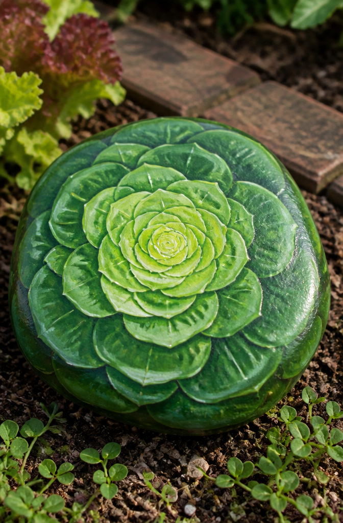
Layered greens turn a flat rock into something that reads as lettuce from ten feet away. The trick is working from the outside in: a deep forest green for the ruffled outer leaves, then a mid-green, then a pale almost-yellow-green where the heart would be. I let each layer dry before the next so the colors do not muddy, which means this is a three-evening project rather than one.
A flat wash looks too perfect, so I load the brush with two tones at once and drag it in short strokes. The outer leaves get a little hook at the tip, like a loose leaf variety curling. For the name, I paint it small along the bottom edge in white so it does not fight the layers above it.
The pale center needs to stay opaque, or the darker layers underneath will kill the glow. I learned that the hard way on my first attempt, where the heart went muddy olive and the whole rock flattened out. Two coats of the lightest green, letting the first go fully matte, fixes it. A satin outdoor sealer over everything keeps the colors from chalking in sun, though I reapply every spring after the winter wet.
10. Beet Rock

A round stone with a flatter top works best for a beet, since the shape already suggests the root sitting in soil with greens shooting upward. Paint the lower two-thirds in deep red, leaving the top third for leafy greens that spill slightly over the edge. The color contrast carries the whole design; the red needs to be bold enough to read from a garden path, not muted into a brownish wash. I learned that lesson on my first try, when the burgundy I chose looked like a muddy potato from three feet away. The leaf section wants several overlapping strokes of bright green, lighter at the tips and darker where they meet the root, so the transition looks like growth rather than a hard line. A small white highlight on the red body, off-center, gives the stone the slight sheen of a just-washed beet.
11. Turnip Rock

The turnip is one of those vegetables that looks harder to paint than it actually is. The whole effect comes down to getting the purple-white shift right, and that shift runs top to bottom, not side to side like you’d expect.
White on the lower half, soft purple on the upper, and the two colors need to meet in a hazy middle rather than a hard line. I blend wet-into-wet for that transition, working fast before the acrylic sets. Too sharp a border and you have a beach ball; too muddy and you’ve lost the turnip entirely. The purple itself should stay muted, almost grayed, nothing approaching eggplant.
The greens above are the payoff. They crown the rock and signal "root vegetable" to anyone glancing from the path. I paint them looser than the body, with ragged edges that suggest leaf texture without requiring a fine brush. One coat of green usually looks flat; two thin layers, letting the first go matte before the second, gives the depth that sells the whole thing from three feet back.
This is one stone where the name label almost feels unnecessary. The silhouette does the work.
12. Artichoke Rock

Teardrop-shaped stones already carry the artichoke’s silhouette, so the work starts with finding one that tapers to a blunt point. River stones with a single raised ridge along the back give the layered look without much carving.
I paint the base in a deep blue-green, almost black in shadow, then dry-brush successive greens toward the tip. Each scale gets a crescent of dusty purple at its base where the leaves fold inward. The trick is keeping the edges soft; a hard line reads as cartoon rather than vegetable. A toothpick dragged through wet paint creates the little notch where scales overlap.
The name goes on the flat bottom in small letters, or on the back if the front reads clearly enough without it. A matte acrylic sealer keeps the purple from turning muddy in sun, though I have had better luck with two thin coats than one heavy one that pools in the crevices. Teardrop stones with a pronounced spine ridge need almost no shading to look dimensional.
13. Celery Rock
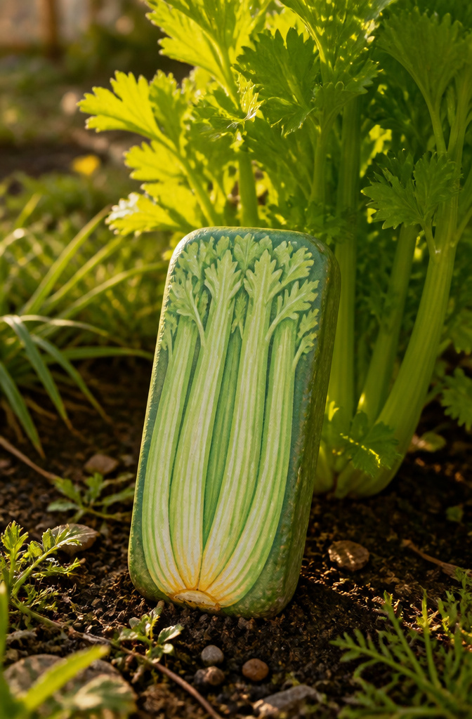
Celery’s pale green stalks with those darker vertical ribs are easier to fake than you’d think, but the stone shape matters more than the paint. A rectangular stone, flat and slightly longer than it is wide, gives you the natural column of a celery bunch without fighting the surface. Rounded rocks make every vegetable look like a potato; here the straight edges do half the work.
I start with a base coat of a yellow-leaning green, something like the pale end of a celery heart, not the dark outer stalks. Once that’s dry, mix a slightly bluer, darker green and drag a thin brush straight down the length in uneven stripes. The ribs on real celery aren’t uniform, so vary the spacing and let some fade partway down. A little white dry-brushed on the raised edges catches light the way a fresh cut does.
The name goes at the bottom in a narrow space, or tucked between two stalks if you’ve painted a cluster. I tried writing across the top once and it broke the vertical line that makes the whole thing read as celery at a glance. The paint held up fine; the composition just felt off every time I walked past it.
14. Kale Rock

Kale leaves give you a lot of room to hide a rough stone surface under paint. The dark bumpy green and those curled edges mean the crinkled texture forgives brushstrokes that would look sloppy on a smoother vegetable, and the natural shadows between the curls let you leave some stone showing through without it reading as a mistake.
I start with a deep blue-green base, almost forest, then dry-brush a brighter sage over the high spots where the leaf catches light. The trick is painting the edges first: thin curls that wrap around themselves, each one slightly lighter on the outer lip and darker where it tucks underneath. You do not need to render every vein; three or four main ribs running from a short stem at the bottom sell the idea.
A flat stone works fine, but one with a little natural pit or ridge near the center gives you a built-in place to sink that stem and let the leaves spread outward like they are growing from the rock itself. The word "KALE" goes underneath in a narrow sans-serif, or tucked into the stem if you want the whole thing to read as one plant.
15. Asparagus Rock

A tapered stone with a point makes the shape almost obvious. The long spear of asparagus asks for something already stretched and narrow, and once you find that silhouette the paint does the rest.
Six thin green lines running purple at the base give the spear its color shift, but the tip is what sells it. The scaled head wants a tight, overlapping pattern, almost like fish scales shrunk down and packed together. I paint those with the tip of a small flat brush, each scale catching a slightly different pressure so the thing looks closed and tight, not drawn on.
The mistake I see most is making the spear too straight. Real asparagus bends a little, especially near the top where the weight of the head pulls it. A slight curve in the stone helps, or a curve in the painted line if the rock itself is stubborn. Either way, the eye reads it as alive instead of pipe-cleaner stiff.
A fine brush and patience at the tip beats a marker here. The scales need to sit in rows, and a marker bleeds at the edges where acrylic keeps the edge.
16. Fennel Rock

A fennel rock lives or dies on finding the right stone shape. You need a clear two-part form: a rounded lower half for the pale green-white bulb, and a narrow upper section for the feathery dill-like tops. River stones with a natural constriction in the middle work best, or you can glue a smaller flat stone on top of a larger oval base to fake the silhouette.
Paint the bulb in layers. Start with a warm white, then wash a thin pale green over the lower half while the white is still slightly tacky. The color bleeds softly that way, no brush marks. The feathery top gets a mix of sage and a touch of yellow ochre, flicked on with a dry brush so the strokes look like fronds rather than spaghetti.
The name goes on the bulb in a small script, low enough that soil won’t cover it. I learned to leave the bottom third unpainted; that part sits in dirt and paint flakes there first. A coat of exterior matte sealer on the upper two-thirds is enough, not the whole rock.
17. Leek Rock

A leek is mostly white cylinder with a pale green fade toward the top, and that long shape fits a flat garden stone better than a round one. I look for a smooth oval river rock at least six inches long, something I can hold in one hand with my thumb on one end and my pinky still touching the other. The root end needs a shaggy fringe of thin pale lines, which I paint by loading a fine brush with thinned white and tapping it upward so the bristles split. For the flat green top, I mix a muted blue-green, not the saturated stuff that comes straight from the tube, and lay it on thick enough that the brush marks look like leaf layers. The name goes at the bottom in lowercase letters, since "leek" is short enough to space comfortably even on a narrow stone. A too-small rock makes the root fringe look like a mistake instead of detail, so if the only stone I have is under five inches, I skip the fringe and just do a clean white cylinder with a green top. That simpler version still reads from the path, which is the point.
18. Rhubarb Rock

A rhubarb rock lives or dies on that thick red-pink stalk against the green leaf, and getting the contrast right matters more than botany-class accuracy. The stalk wants a couple of coats of bright pink, maybe with a darker red line down one side so it reads as round instead of flat. The leaf spreads wider than you’d think, almost fan-shaped, and needs a solid green base with a lighter vein or two brushed in while the first layer is still tacky.
On smaller stones, the leaf becomes a problem. A tiny surface can’t hold both elements without the paint muddying together, so the leaf gets simplified to a single green cap at the top or left off entirely. The stalk alone still reads as rhubarb if the color is vivid enough; pale pink and the vegetable disappears into just another decorated rock.
19. Cabbage Rock

A smooth, round stone gives the cabbage its natural starting point. The trick is building the head from the outside in, not the other way around. I lay down a base coat of medium green across the whole surface, then let it dry to the touch before the real work starts.
The outer leaves need three or four concentric rings of darker green, each one slightly smaller than the last, painted with a flat brush held at a low angle so the edges feather out. The center tightens into a near-circle of pale lime, almost yellow, with a hint of white dry-brushed on last to catch light. The color shift from dark to light does the dimensional work; no outlining required.
Between rings, a ten-minute drying window keeps the tones from muddying. Rushing it turns the whole head into a single flat green disc, the mistake I made on my first try. The layered leaves should read as wrapped, not striped, and that only happens when each ring sits distinctly on top of the last.
20. Parsnip Rock

For a parsnip, the pale cream root widens at the shoulder and tapers like a cone that someone gently squeezed. I start with a base coat of warm off-white, something closer to buttermilk than stark white, since the real vegetable carries that faint buttery cast. A thin wash of raw umber along the lower edge gives the taper its shadow without turning the whole rock muddy.
The tops are where most people trip up. Parsnip greens are softer and more finely cut than carrot tops, more like dill that got ambitious. I use a liner brush and mix two greens: a muted sage for the stems and a yellow-tinged olive for the wispy ends. Three or four fronds are enough; too many and the rock starts looking like a mop.
The name goes near the bottom in a low-contrast brown. Cream paint doesn’t give you much room for bright white lettering, so I drop to a tan or light gray and keep the letters small. The root itself should do most of the talking.
Frequently Asked Questions
What are some ideas for painted garden stones with vegetable names?
Carrot, squash, corn, pea pod, green bean, potato, broccoli, cauliflower, lettuce, beet, turnip, artichoke, celery, kale, asparagus, fennel, leek, rhubarb, cabbage, and parsnip all make excellent subjects. Each vegetable has a distinct shape and color pattern that translates well to stone, from the tapered orange carrot to the layered green cabbage head.
How do you paint vegetable rocks for the garden?
Start by hunting for stones whose natural shapes already suggest the vegetable, then build color in layers with acrylic craft paint. Let each coat dry matte before adding the next, and finish with an exterior sealer to survive sun and rain. The article details specific techniques for each vegetable, such as using a dry brush for carrot texture or a torn sponge for cauliflower curds.
What materials do I need for painting garden stones with vegetable names?
You need smooth or suitably shaped stones, acrylic craft paints in vegetable-appropriate colors, flat and liner brushes, a torn sponge for textured vegetables like cauliflower, cotton swabs for small round details like peas, and an exterior matte sealer to protect the finished work through the seasons. Some projects also call for a toothpick for fine notches or dry-brushing tools for texture.